Statistical Design of Experiments · Windows desktop app · version 0.4.0

Design of Experiments —
built for professional use.

DoEStat is the complete DoE suite for development, formulation and process optimization: every relevant design type, modern analysis and multi-response optimisation — with direct import of existing Design-Expert projects.

.dxpx
Direct import of existing projects
0
Forced cloud — your data stays local
DoEStat main window: on the left the workflow rail showing progress “6 of 8 · analysis” and, below it, the size of the design; in the centre two contour plots for the responses yield and purity over temperature and pressure; on the right the slider for the held factor and the list of runs with measured and predicted value.

Contour plots from a three-factor central composite design (CCD) with 19 runs.

Factorial RSM · CCD Box-Behnken Mixture D/A/I-optimal Split-Split-Plot Taguchi Definitive Screening Nested

01 / Features

Everything professional DoE work needs

From screening to multi-response optimization — DoEStat covers the entire DoE workflow, with no add-on modules and no forced cloud.

Scope

One program, start to finish

From planning through data entry to analysis, optimisation and the report — in one application, with no add-on modules and no separately licensed extensions. Which designs and which analyses those are in detail is listed in the two sections below.

Methodology

Scientifically grounded

Every statistical method follows a published standard reference (Montgomery, Myers, Cornell, Box & Hunter, Scheffé, Jones & Nachtsheim …), cited in the source code. Numerical kernels are checked against R and NIST reference data.

Engineering

Modern & fast

Native .NET 9 Windows application: your data stays on your machine — no cloud lock-in, no dependency on external servers. Bilingual interface (German/English) with contextual help and result interpretation.

Migration

Switch without losing data

If you work with Design-Expert you will feel at home right away: same terminology, same workflows — from design selection through ANOVA and diagnostics to desirability optimization. Existing project files (.dxpx) import directly, with a preview and a list of notes before anything is taken over.

Design table of a central composite design with 19 runs: columns for temperature, pressure and catalyst, the point type of each row (corner, axial, centre) and the measured values for yield and purity.
Design table with point types, randomisation and the entered measurements.
Derringer-Suich multi-response optimisation: overall desirability D equals 0.88, the best factor settings in natural units, confidence and prediction intervals per response, and ramp traces for factors and responses.
Multi-response optimisation: desirability across both responses, with intervals at the optimum.

02 / Charts

From design to optimisation, chart by chart

A design of experiments is only as good as the pictures it yields. The twenty charts below follow the way the work runs — judge the design, separate the effects, check the model, find the optimum, estimate the spread. Every one comes out of DoEStat itself, not a mock-up and not stock artwork. One click shows it full size.

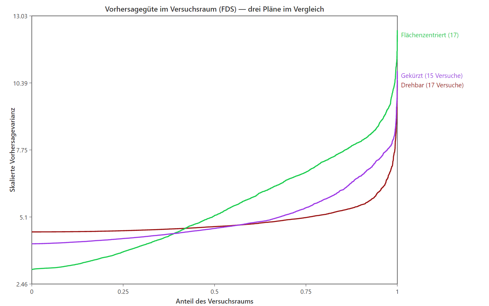
Three curves compared: each shows what share of the design space stays below a given scaled prediction variance. The curves for a rotatable, a face-centred and a reduced design run differently and only rise steeply at the right-hand edge.
Fraction-of-design-space curvesHow precisely a design predicts across the whole experimental region — before a single run is made. This is how you compare candidate designs and decide whether 15 runs will do or 17 are needed.
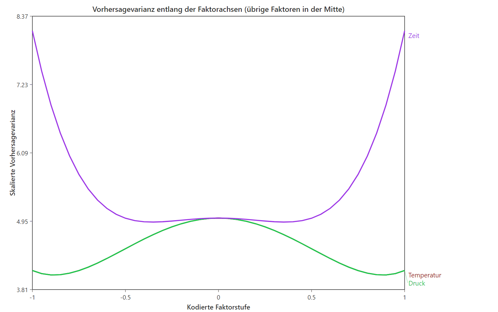
Two curves over the coded factor level from minus one to one. Both are flat in the middle and rise towards the edges, the curve for time considerably more than the one for temperature and pressure.
Prediction variance per factorWhere in the design space the model is confident and where it turns vague. Shows at which edges extra runs would buy the most information.
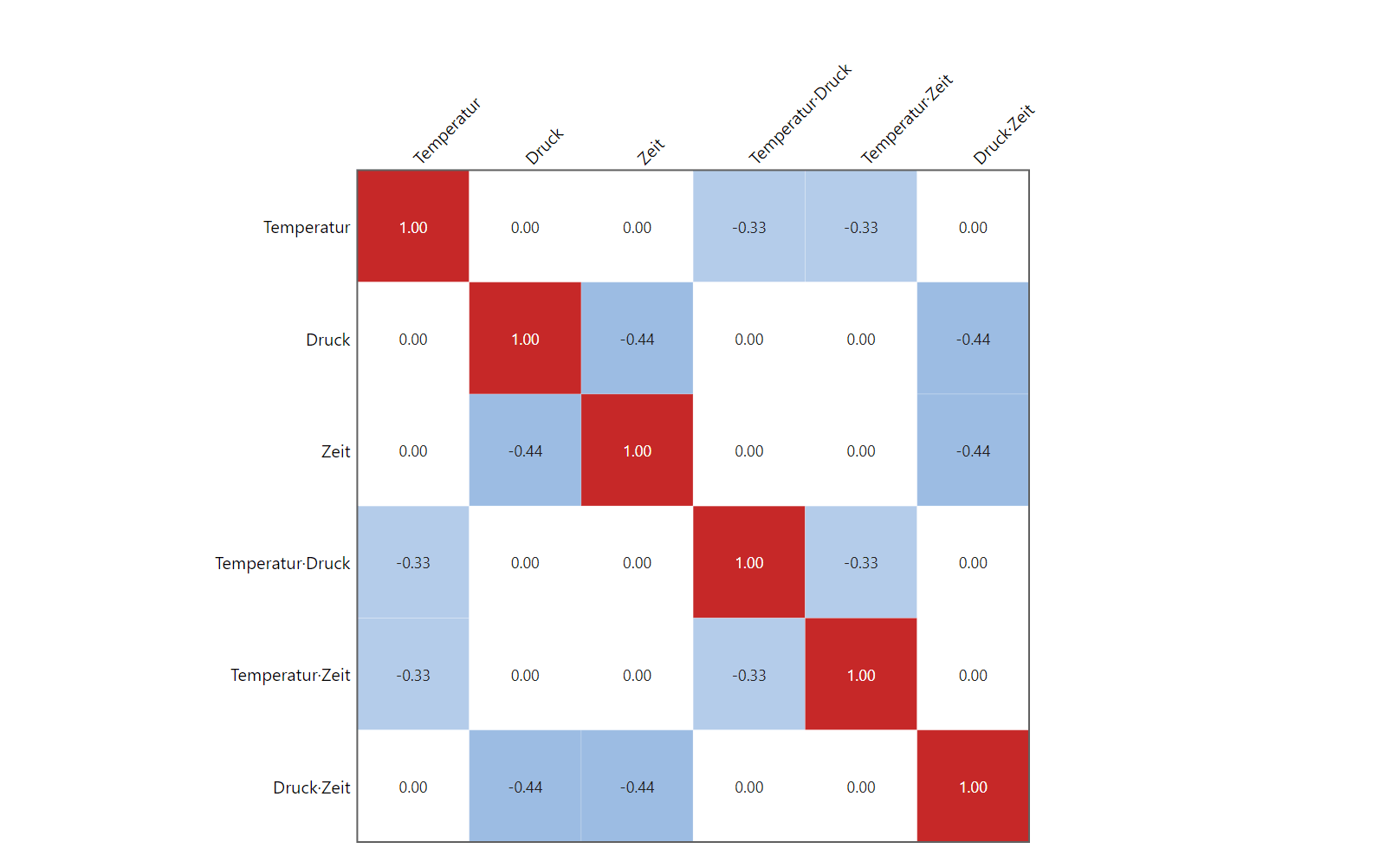
Square colour matrix with six rows and columns for temperature, pressure, time and their interactions. The diagonal is red at 1.00, and several off-diagonal cells are blue with values such as minus 0.33 and minus 0.44.
Correlation matrix of effectsWhich terms overlap one another. A coloured cell off the diagonal means those two effects cannot be told apart cleanly with this design.
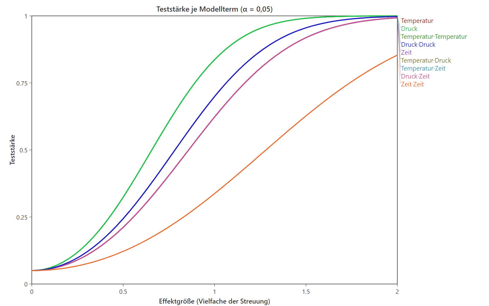
A family of rising curves over effect size from zero to two. Each curve stands for one model term and is labelled on the right; all approach a power of one.
Power curvesHow large an effect has to be before the design can detect it at all. Answers the question of how many runs are needed with a calculation instead of a hunch.
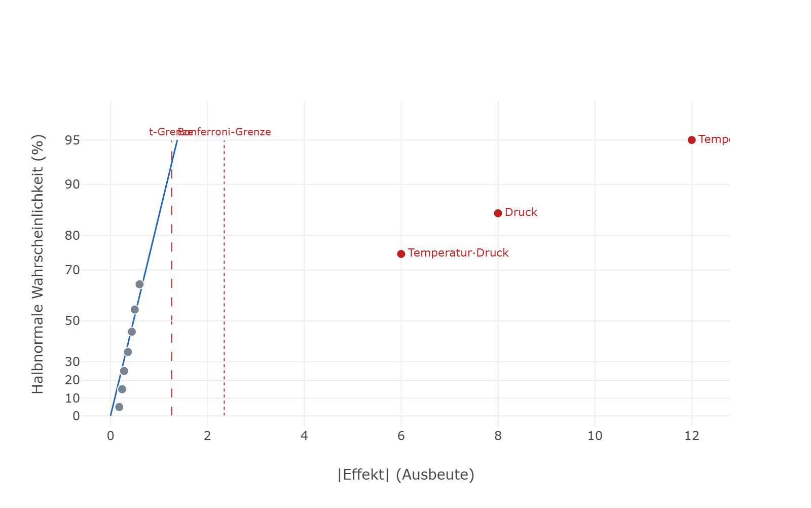
Half-normal plot: many small points sit tightly along a steep line near zero, while three labelled points stand well out to the right. Two dashed vertical lines mark the t limit and the Bonferroni limit.
Half-normal plot of effectsAll estimated effects against the noise line. Whatever sits on it is chance; whatever departs from it is real — the fastest way to boil a screening run down to the few factors that matter.
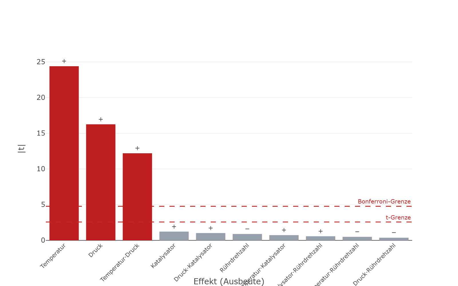
Bar chart of effect magnitudes in descending order: three tall red bars followed by seven short grey ones. Two dashed horizontal lines mark the t limit and the Bonferroni limit.
Pareto chart of effectsEffects ranked by magnitude, with the t and Bonferroni limits drawn in. Shows at a glance which terms belong in the model and which can be dropped without loss.
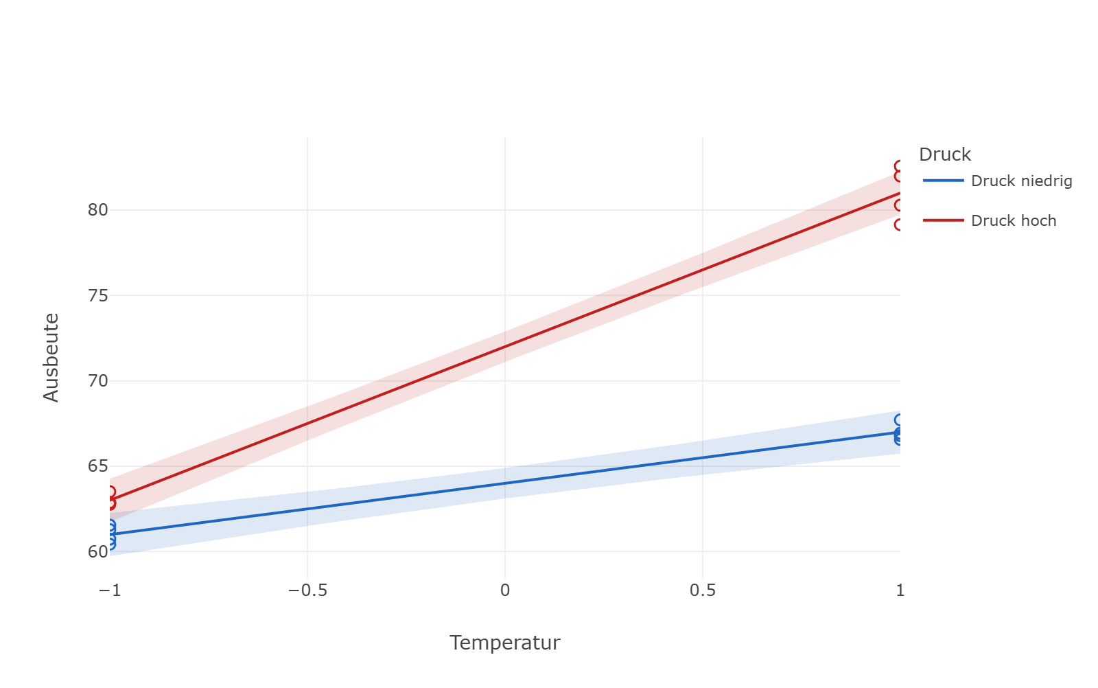
Two rising lines over the temperature axis, each with a shaded confidence band: the red line for high pressure climbs noticeably more steeply than the blue one for low pressure, and the gap between them widens to the right.
Interaction plotNon-parallel lines mean the effect of temperature depends on pressure. That is precisely what a one-factor-at-a-time series cannot see.
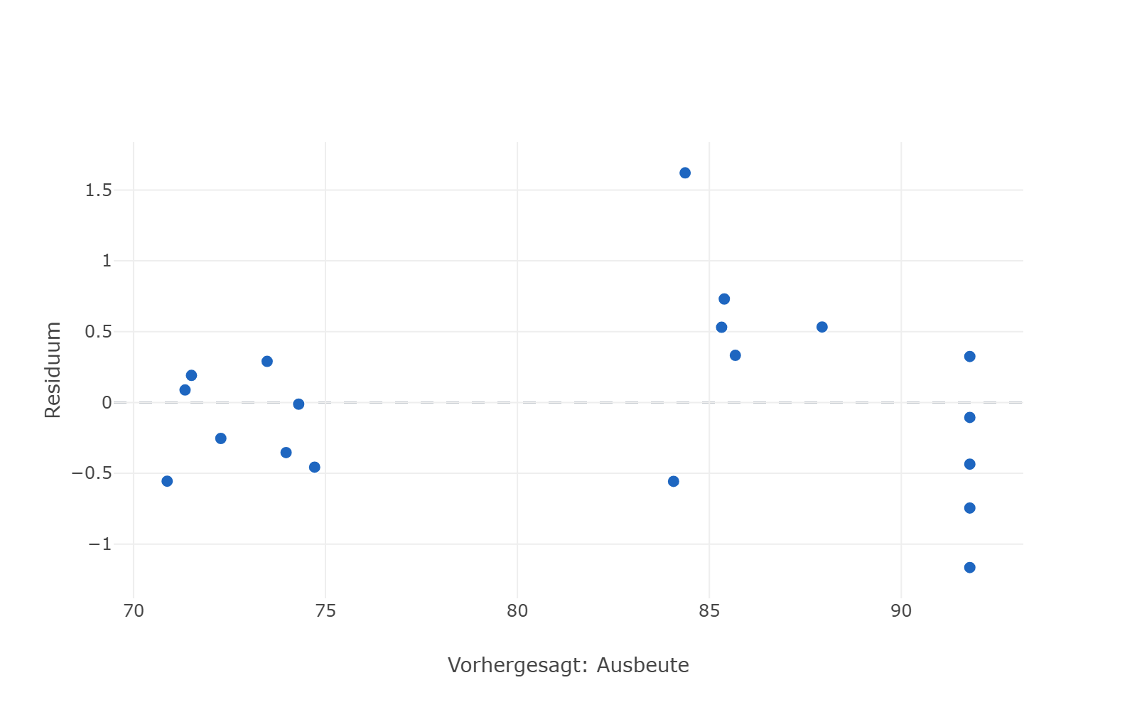
Scatter of residuals against predicted values, spread evenly above and below a horizontal zero line, with no visible funnel or arc.
Residuals versus predictedHow the leftover error is spread. A funnel or an arc in it means the model is still missing something systematic — the check that comes before any conclusion.
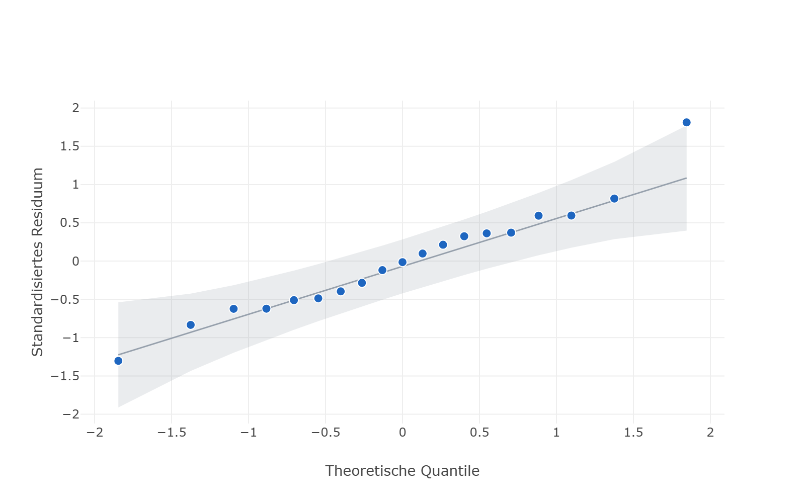
Normal Q-Q plot: the standardised residuals form a rising row of points close to a straight line, surrounded by a grey confidence band that widens towards the ends.
Normal Q-Q plotTests the normality assumption the model rests on. If the points stay inside the band around the line, the p-values and confidence intervals hold — otherwise they do not.
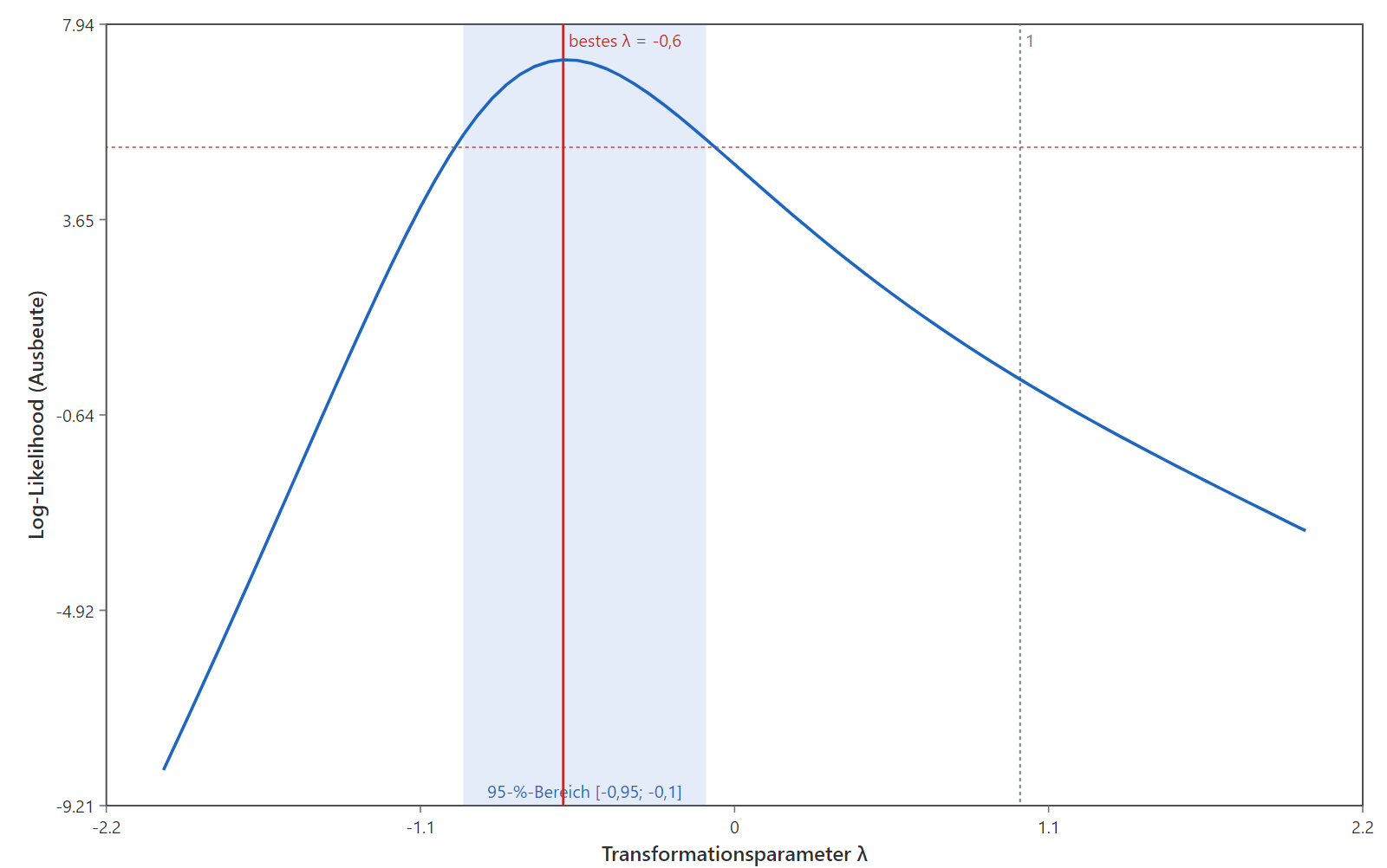
Bell-shaped log-likelihood curve over the transformation parameter lambda, with a red vertical line at the best lambda of minus 0.6 and a pale blue 95 per cent interval from minus 0.95 to minus 0.1.
Box-Cox plotWhether the response needs transforming before the model is read. If one lies outside the confidence interval, the analysis belongs on a different scale.
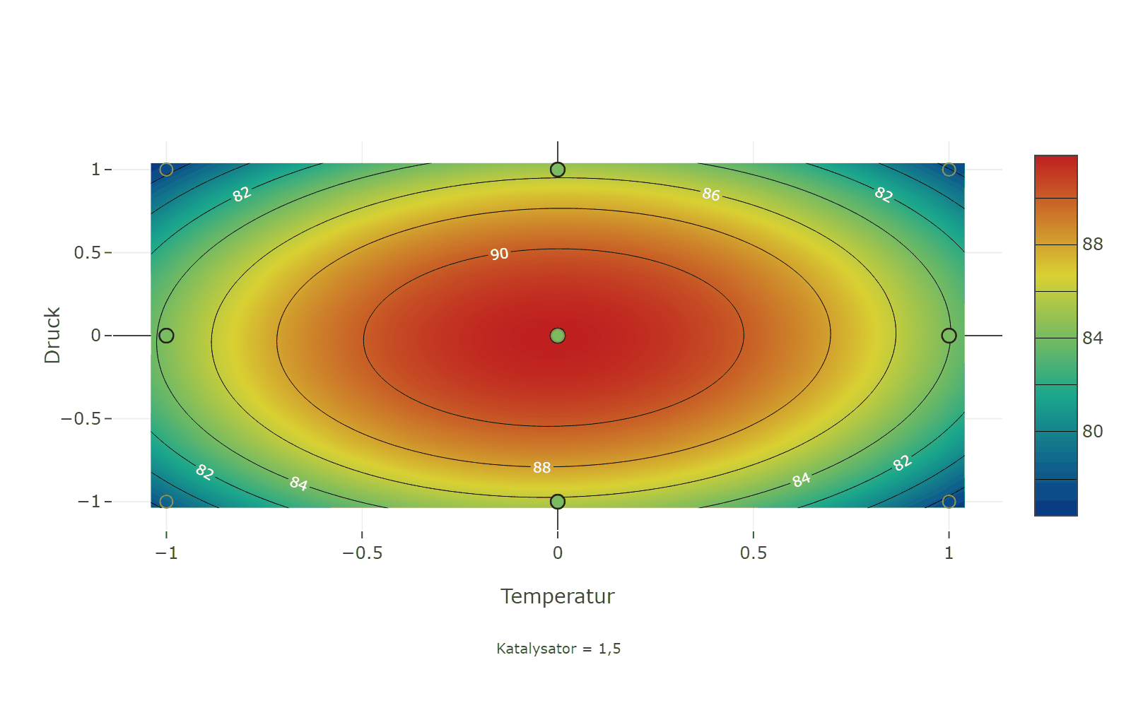
Contour plot of yield over temperature and pressure: coloured contour lines from about 78 to over 91, the maximum as a red region in the centre, the experimental runs drawn as circles, a colour scale on the right and the note catalyst = 1.5 underneath.
Contour plotLines of equal yield across two factors, with the runs actually carried out drawn on top. Shows which window of temperature and pressure holds the response — and how far you may drift before it breaks.
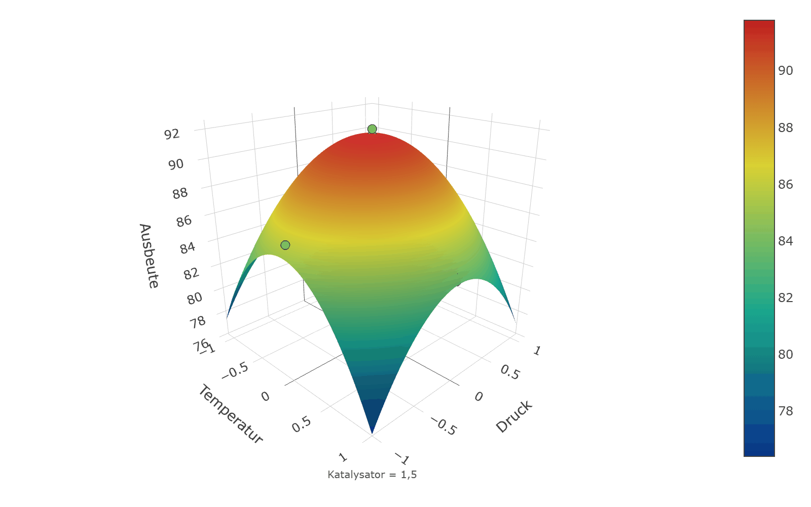
Spatial view of the same fitted surface: a curved dome over the temperature and pressure axes, coloured from blue at the edges to red at the peak, with yield on the vertical axis.
3-D response surfaceThe same fitted surface in space. Makes saddles and ridges visible that are easy to miss between contour lines.
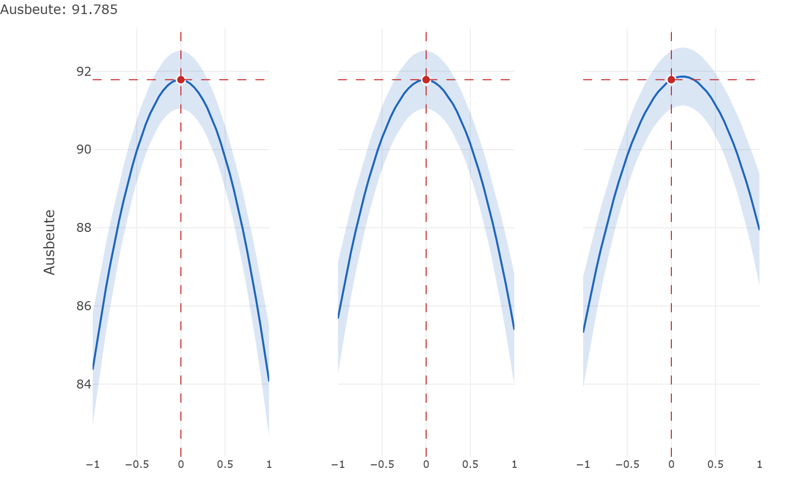
Three panels side by side, one each for temperature, pressure and catalyst. Each holds a downward-opening curve with a pale blue confidence band and a red marker at the current setting.
Prediction profilerOne curve per factor through the current setting, with a confidence band. Answers “what happens if I raise the temperature by two degrees?” without running another experiment.
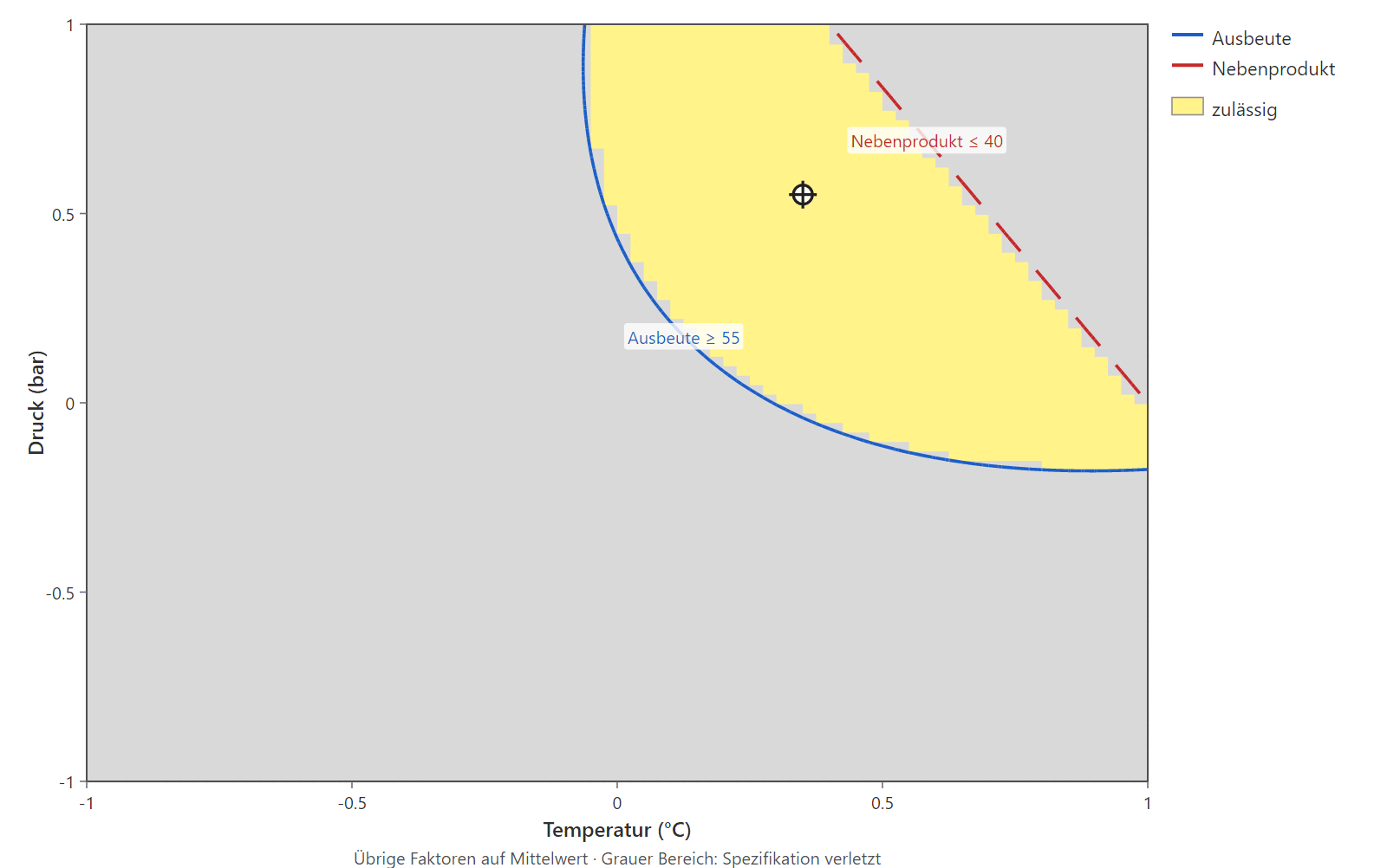
A two-dimensional field over temperature and pressure. A yellow region marks the admissible zone, bounded by a blue line for yield of at least 55 and a dashed red one for by-product of at most 40; everything outside is grey.
Overlay plot (sweet spot)Every specification limit laid over the others. The yellow region is the window in which all responses are met at once — the answer to “where am I allowed to operate?”
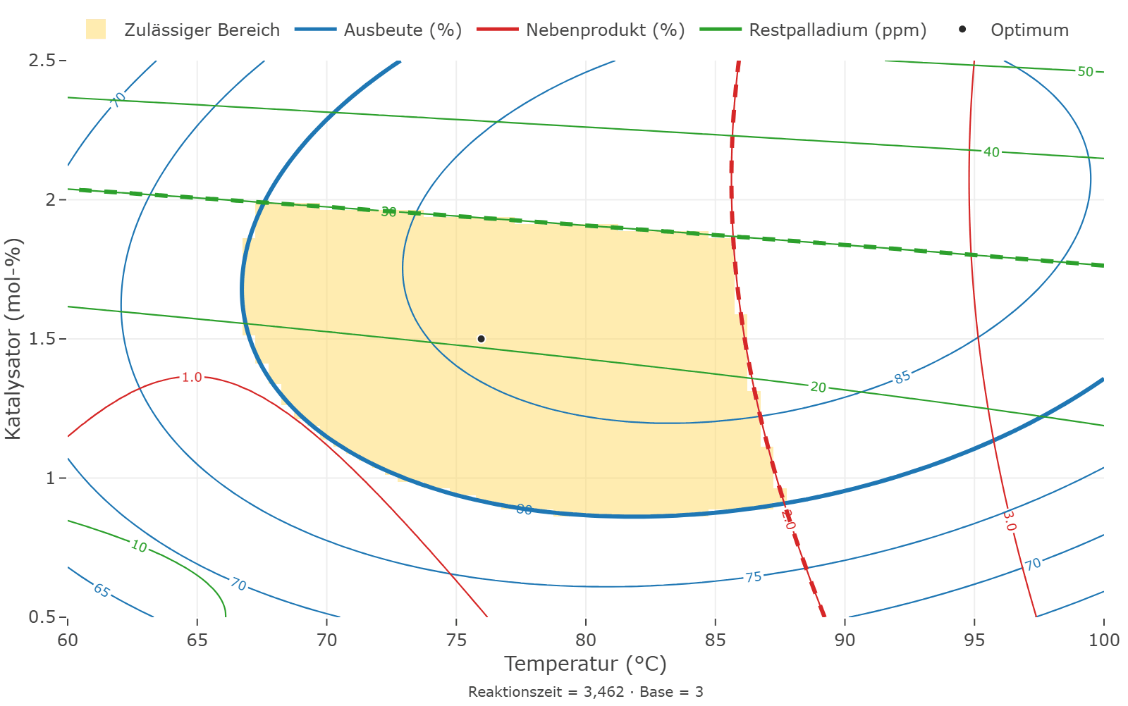
Overlaid contour plot over temperature and catalyst: contour lines of three responses in blue, red and green. A shaded region is bounded by a heavy blue line and two dashed lines in red and green; a dot inside marks the optimum.
Overlaid responsesThe contour lines of several responses in one picture, each in its own colour. Heavy lines are the limits, the shaded region is the sweet spot — and the dot inside it the optimum.
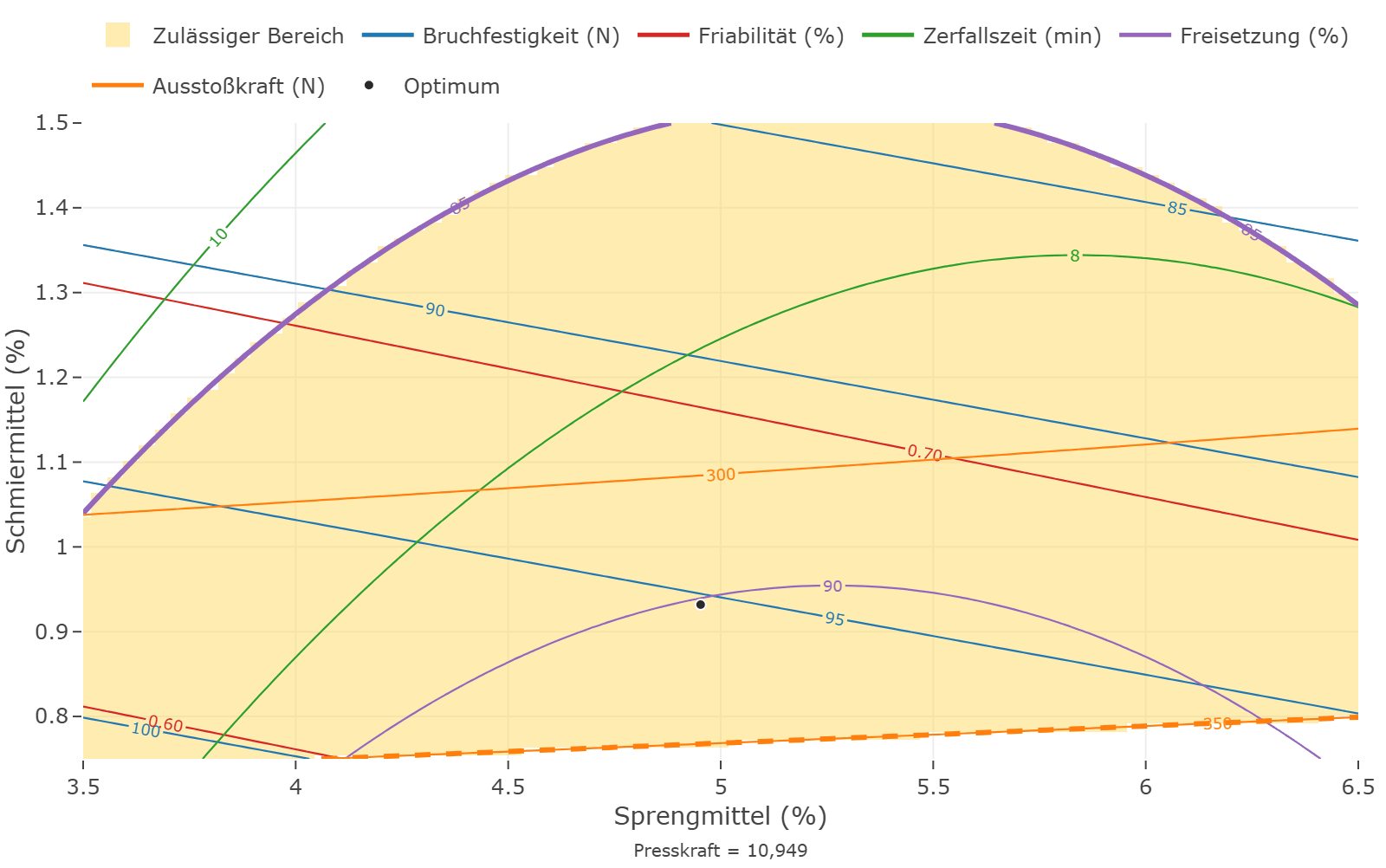
Overlaid contour plot over disintegrant and lubricant with contour lines of five responses in five colours. The shaded region is bounded at the top by a heavy violet arc and at the bottom by a dashed orange line.
Sweet spot with five responsesFive responses, five colours. Two limits cut the window, the others lie outside the picture — one sees at a glance which requirement determines the latitude.
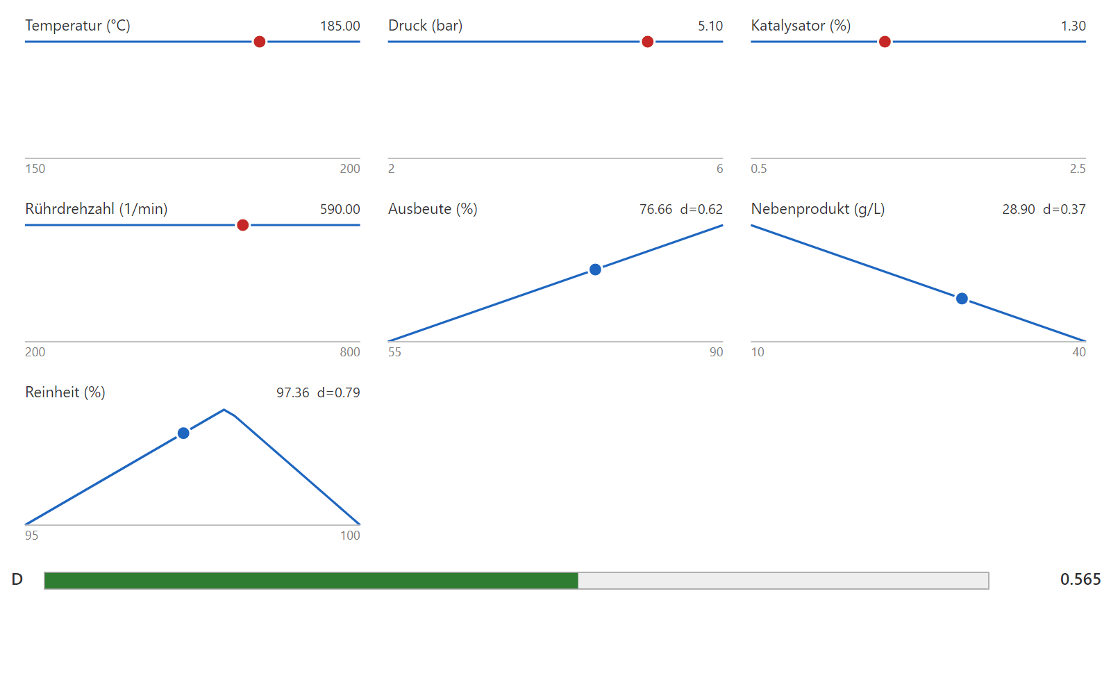
A row of sliders for temperature, pressure, catalyst and stirrer speed with red markers, below them desirability ramps for yield, by-product and purity, and a green bar showing the overall value 0.565.
Ramps — every quantity at a glanceThe operating point that was found, and what it means for each individual response, in one picture. Drag one slider and every prediction moves with it.
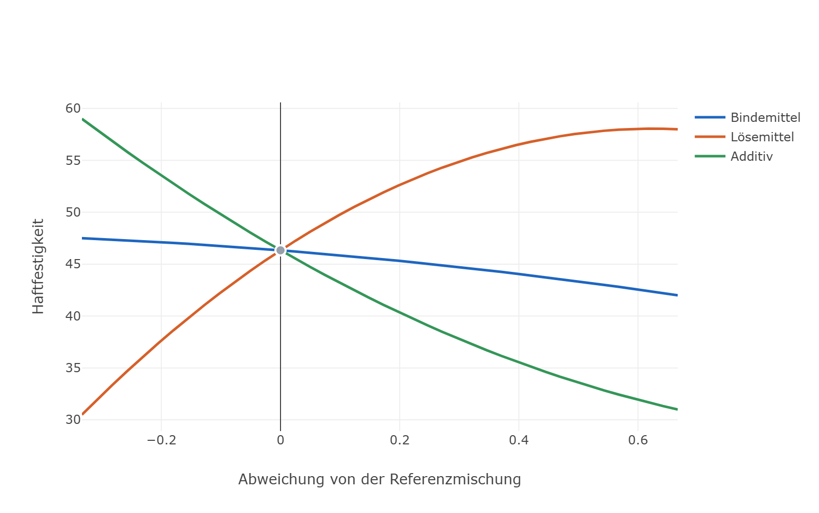
Three coloured curves — binder, solvent and additive — pass through a common crossing point in the middle. The solvent curve rises steeply, the additive curve falls, and the binder curve runs almost flat.
Mixture trace plotHow the response moves when one component rises at the expense of the others. For formulations whose parts must add up to 100 %, so no ingredient can be varied on its own.
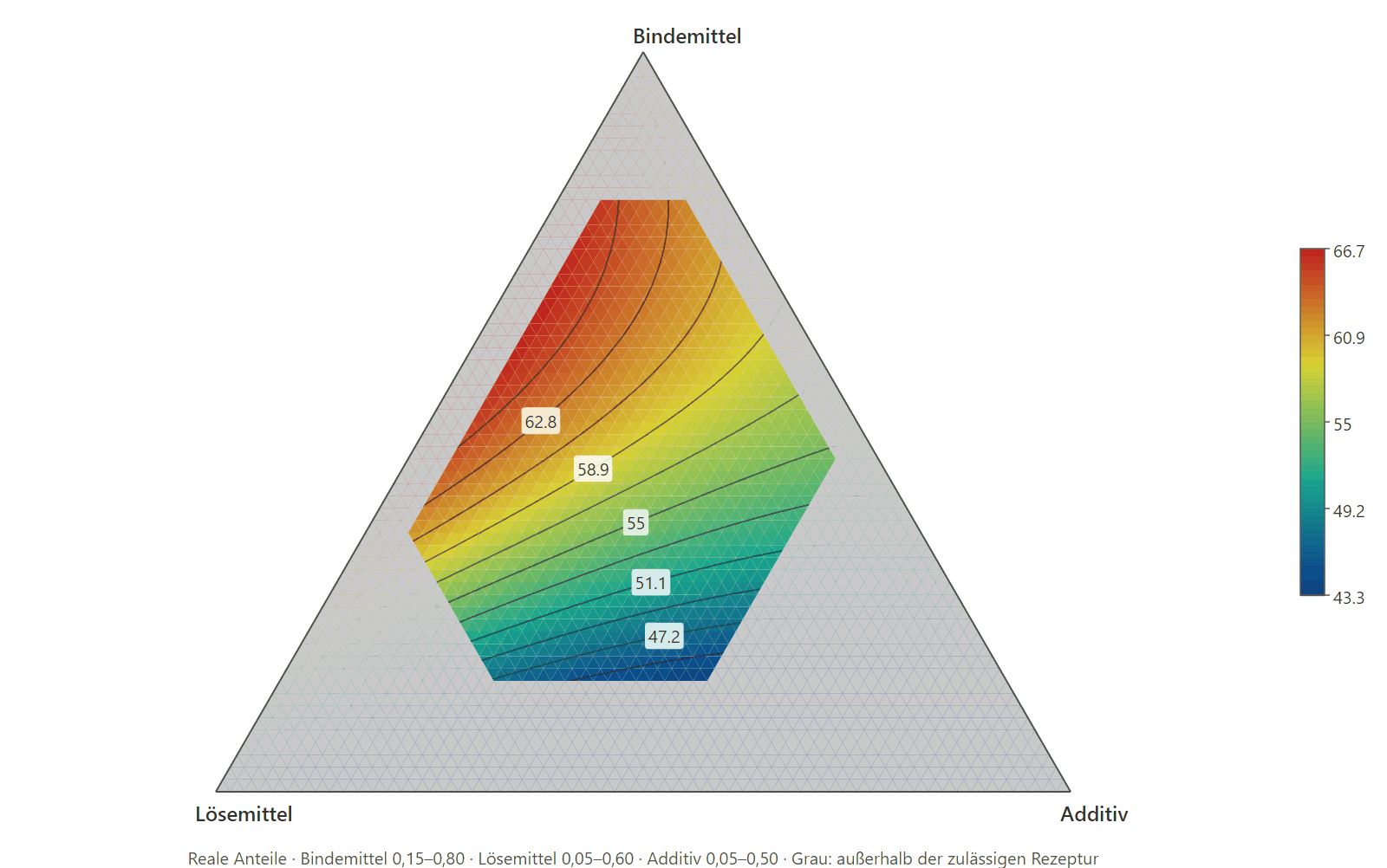
Triangular diagram with binder, solvent and additive at its corners. Inside sits a coloured region with contour lines from about 47 to 66; the area outside the admissible formulation is shaded grey.
Ternary contour plotThe response across every ratio of three components. The grey margin is what the formulation limits rule out — you see immediately how much room is left.
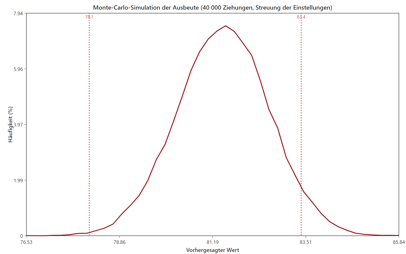
Bell-shaped frequency distribution of the predicted yield from 40,000 draws, with two dashed red vertical lines at 78.1 and 83.4 marking the specification limits.
Monte Carlo simulationHow much the response varies once the settings scatter in production. The area beyond the limit lines becomes the scrap rate you should expect.

03 / Designs

The design your question calls for

Nineteen design types, no add-on module. Which one fits depends on whether you are screening factors, mapping a response surface, formulating a blend or hardening a process against noise.

Screening

Many factors, few runs

  • Full factorial — every level combination, 2k and mixed-level
  • Fractional factorial 2^(k−p) — with alias structure and resolution III–V
  • Plackett-Burman — main effects in N = 8, 12, 20 or 24 runs
  • Definitive screening (DSD) — three levels, quadratic effects stay separable
  • Min-run resolution IV — equireplicated fraction, main effects clear of two-factor interactions
  • Min-run resolution V — same idea, interactions additionally clear of each other

Response surfaces

Mapping curvature

  • Central composite (CCD) — rotatable, face-centred or inscribed
  • Box-Behnken — three levels without corner points, when corners are infeasible or costly

When no standard design fits: optimal designs

One design type, four objectives:

  • D-optimal — sharpest coefficients overall
  • A-optimal — smallest average coefficient variance
  • I-optimal — smallest average prediction variance across the region
  • G-optimal — smallest worst prediction variance

Built by coordinate exchange, able to hold already-executed runs fixed. If a factor is hard to change, the result becomes a split-plot design with its own randomisation stratum.

Mixtures

When the parts sum to one

  • Simplex-lattice — {q,m} grid over the simplex
  • Simplex-centroid — pure components and every equal-parts blend
  • Extreme vertices (constrained) — vertices of the polytope that bounds cut out of the simplex, plus face centroids
  • Mixture: optimal — criterion-driven, when the region admits no standard lattice
  • Mixture × process (crossed) — formulation and processing conditions as a tensor product
  • Mixture-amount — when not only the ratio matters but the total amount

Robust & special

Against noise and structure

  • Taguchi array (L4 … L36) — orthogonal arrays, two-, three- and mixed-level
  • Robust parameter design (inner/outer) — control factors crossed against noise factors
  • Nested (hierarchical) — units within units, e.g. batch → sample → measurement
  • Latin hypercube — space-filling, for simulations rather than physical runs

Augment instead of starting over: an existing design can be extended — fold-over against aliasing, axial points turning a two-level design into a CCD, points for the lack-of-fit test, or a criterion-driven top-up that holds the already-executed runs fixed. That is not a design type of its own but a step on top of what you have already measured.

04 / Analysis

What becomes of the measurements

A design is half the work. The other half is deciding which effects are real, whether the model holds, where the optimum sits — and how certain any of it is.

Model & fit

  • Regression with ANOVA — coefficients, F tests, R², adjusted and predicted R²
  • Lack-of-fit test — separates model error from pure experimental error, where replicates exist
  • Model selection — backward elimination by AIC/BIC without breaking term hierarchy
  • Box-Cox — estimates the response transformation by profile likelihood, with an interval for λ
  • Generalized regression — ridge path against ill-conditioned model matrices, selected by AIC/AICc/BIC

Separating effects

  • Half-normal plot — separates real effects from noise
  • Pareto chart — effects by magnitude, with t and Bonferroni limits
  • Lenth PSE — estimates error spread from the effects themselves when no degrees of freedom remain
  • Two-stage DSD analysis — main effects from the fold-over space, quadratic terms from the difference space

Diagnostics & prediction

  • Residual analysis — studentised residuals, normal QQ, behaviour over prediction and run order
  • Influence diagnostics — leverage, Cook's D, DFFITS
  • Multicollinearity — VIF per term and the correlation matrix of the effects
  • Prediction with intervals — confidence interval for the mean, prediction interval for a single measurement
  • Confirmation runs — checks whether re-measured runs fall inside the model's prediction interval

Structure & distribution

  • Split-plot (REML) — its own error stratum for hard-to-change factors
  • Split-split-plot (REML) — three randomisation strata instead of one
  • Nested ANOVA — variance components of hierarchical units, via EMS and REML
  • Mixed models — random effects with Wald inference on the variance components
  • Binomial & Poisson GLM — IRLS with the canonical link, for proportions and counts
  • Mixture ANOVA — Scheffé models without an intercept, plus mixture traces

Optimisation & robustness

  • Desirability (Derringer-Suich) — several responses into one weighted overall desirability
  • Pareto front — shows what one objective costs the other
  • Profiler & ramps — every quantity on its own track; drag a factor, see the effect at once
  • Overlay / sweet spot — the region where every specification holds at the same time
  • Propagation of error (POE) — the spread a response inherits from factors that are not set exactly
  • Monte Carlo — distribution, defect rate and Cpk per response
  • Robust parameter design — S/N ratios and two-step optimisation: variance first, then the mean

Evaluating the design

  • Power per effect — the probability of actually detecting an effect of a given size
  • Replicates from power — how many replicates a target level requires
  • Efficiencies & prediction variance — D, A and G efficiency, FDS curves, prediction variance across the region
  • Strategy comparison — screen first and then refine, against one single large design

Every method follows a published standard reference cited in the source code — Montgomery, Myers, Cornell, Box & Hunter, Scheffé, Jones & Nachtsheim, McCullagh & Nelder and others.

Try DoEStat for free

30 days, the full feature set, no payment details. We send the download link by e-mail, usually on the next business day.

Enquiries about DoEStat are currently handled by our partner STATCON. Training and DoE consulting on request.
[email protected]